As part of our recent branding project for a local queer organisation, we did a lot of research on LGBTIQ+ organisations around the world. Never one to hoard knowledge, below is some of our research.
When looking at groups like this, there are obviously going to be commonalities and trends. While some of the brands we looked at completely stood apart, many of them shared the following elements.
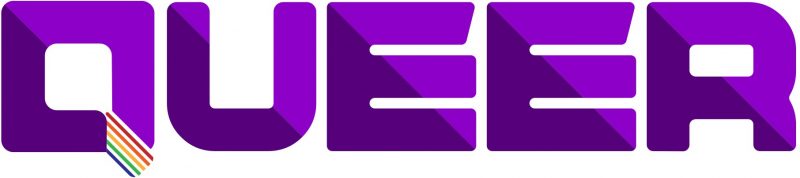
Rainbow colours
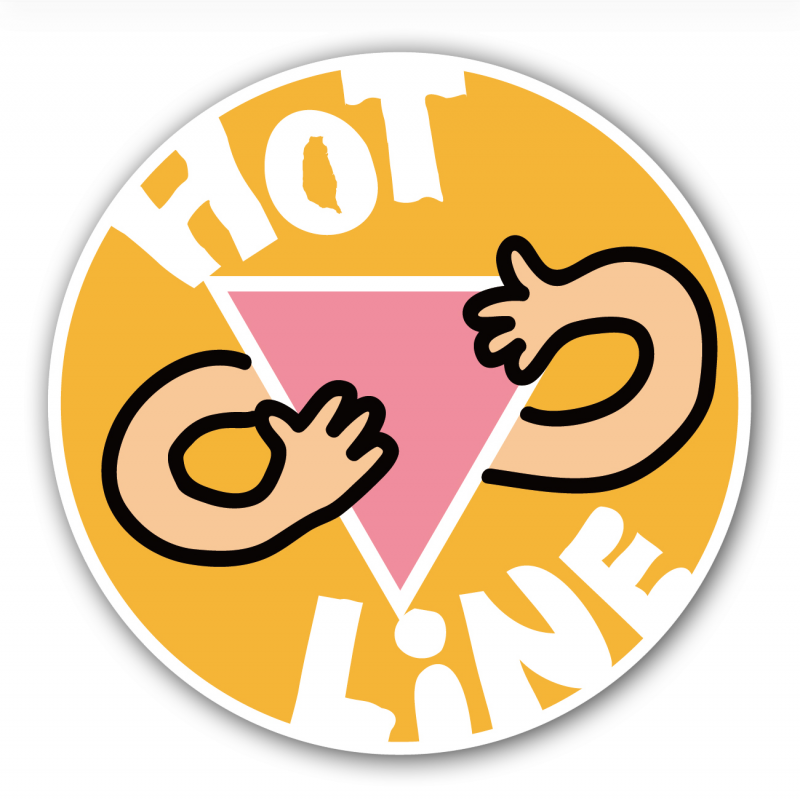
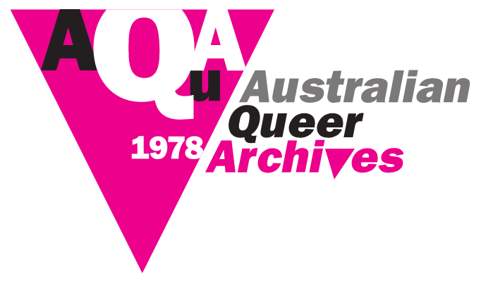
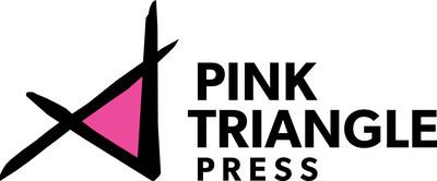
Inverted triangle
If you’re not aware of the significance of the inverted triangle, check out this post on queer symbols and icons.
Everything else
Then there’s a bunch of nice logos that don’t follow the obvious trends, other than the use of bold colours and solid fonts.


Leave a Reply